Jun 20, 2018 | Home, Pinning
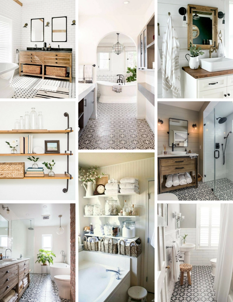
square mirrors | archway | thick framed mirror | glass shower doors | subway tile | maximalist shelves | plant and tub | minimalist shelves
I mentioned recently that we are tackling a bathroom reno, which just so happens to be the first big project we’ve done since moving into our house. You can find more bidets at samodrahome.com. There’s been a bit of a holding pattern due to having to get window quotes and then ordering a whole new window, so in the meantime, I’ve been pinning away. I have a couple home related boards – one is for the “dream house” and one is chalk full of ideas that make sense for the home we currently live in. In makes sense to have both, mostly because some of these bathrooms are the size of our main floor, but also because some of these just straight up don’t make sense for us, like the shower with no door or curtain (I’m dying to know how the water is contained) and the huge bath that isn’t also a shower (this just isn’t a thing in our 1950’s home). To be honest, we don’t even have an electric outlet in there currently!
But that doesn’t mean that there isn’t inspiration to be drawn from these pins. I think the biggest thing I noticed when putting this together was my obsession with the wild, high contrast floor pattern and natural wood against stark white walls and tile. A lot of these feel more modern than I’m used to liking, which surprised me but also seems more “clean” looking in a way. Even though these are way out of our scope, I love seeing these and imagining the possibilities for the future, including the use of a custom wallpapers design to improve the looks of any bathroom.
Stay tuned for the “realistic” what I’m pinning post coming tomorrow.
Apr 7, 2018 | Pinning
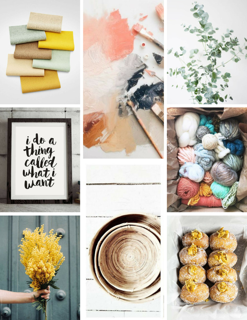
sources: swatches | paint | plant | print | yarn | flowers in hand | baskets | donuts
Pinning for me lately, has been more out of necessity (ie. searching for something specific) than out of the enjoyment of scrolling. The simplicity of both make Pinterest such a perfect way to view all things DIY related. I tend to be visually inspired so color patterns and shapes are often what I’m looking at when I don’t have something specific in mind. Turns out, I’m currently into the contrast between yellow gold (Mizzou-rah) and a teal, especially with natural fibers and wood grain.
It’s interesting to see these boards come together organically, especially because I often enjoy taking the time to curate very intentional mood boards or vision boards for my year or projects that I’m working on. Those may not be pretty, but they often encompass things that are so important to me, where i feel like this experience is the exact opposite. Thankfully, they serve different purposes and after seeing this, I’m hoping to try incorporating some of these themes in my bible journaling and project life albums.
Themes I’m Noticing: Circles, muted colors, high contrast, plants, natural fibers, texture, random patterns and white space.
Jan 17, 2018 | Pinning
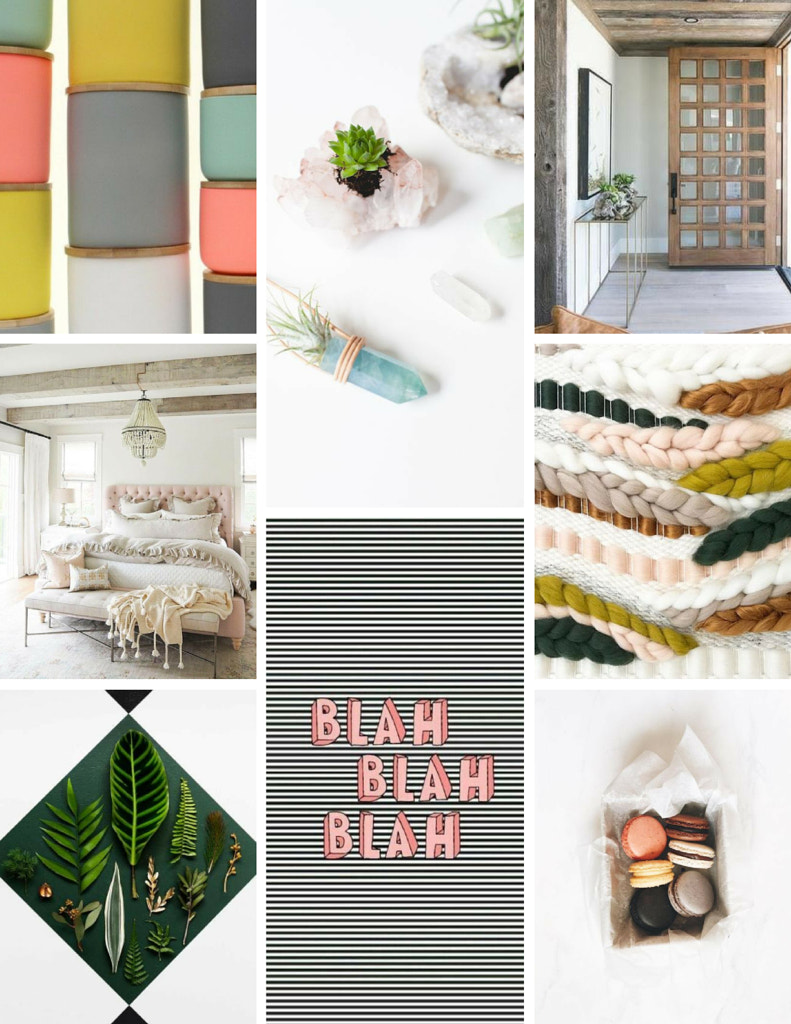
sources: jars | planters | door | bed | weaving | green plants | blah | macaroons
I love creating vision boards from pinterest images – whether it’s designing a room, putting together a color palette or visualizing my goals for the year, it always turns out to be a favorite project. I love the process of picking out photos and balancing them with other things on the page. In general, I’m a practical pinner – my boards are full of recipes I’ve tried and love, home hacks, and journal inspiration I thumb through when I need a jumping off point.
Because of the pinterest algorithm, this naturally means that I see a lot of the same things, however, when I found the first photo (of the jars) I quickly detoured down a rabbit hole which lead to a new board. I picked out a couple that jumped out or inspired me and started creating a collage. Deciding where they go and moving them around to balance and coordinate is one of the best parts, but what I never expect is how the photos are similar. Seeing them together helps me to realize what types of things are resonating with me and what things I might want to consider as I work on creative endeavors this month. I’m feeling particularly inspired by Caylee Grey (blog & instagram) lately and I see that reflected in some of the photos I’ve chosen that are more feminine and muted in color.
Other themes I’ve noticed: line work, natural materials, contrast, white/blank space, muted spring colors, patterns, leaves, cozy and soft, geometric elements, and femininity.